Art Guide
High, Low and Superflat- Murakami Deconstructed
The super flat world of Murakami's flowers - here's what you need to know.
By Ode To Art
Read the original article here: http://www.christies.com/sales/neon-dreams-kusama-murakami-nara-2013/murakami.aspx
HIGH, LOW AND SUPERFLAT
Murakami Deconstructed
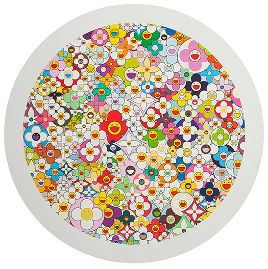
Takashi Murakami, First Love, Flower (2010), screenprint, platinum leaf; © Christie’s Images and Takashi Murakami
When Japanese artist Takashi Murakami finished art school in 1993, he left with a PhD and the determination to redefine contemporary Japanese art in terms that were distinctly Japanese. “On one hand, I am trying to show my compatriots what ‘art’ means on a global scale,” he said, “and on the other, to the foreigners, I am trying to show the essence of our current culture.”
Screenprinting was the first printmaking technique Murakami employed after graduating from school - it was a perfect medium for developing his new theoretical framework for Japanese art, which he called “super flat”. The term was meant to describe the melding of high and low culture found in the Japanese aesthetic tradition. As Christie’s junior print specialist, Lindsay Griffith explains, traditional Japanese ukiyo-e, or “floating world,” woodcuts, for example, were intended for a mass audience, despite their objectively “high art” formalism. “‘Super flat,’ for Murakami,” she explains, “is about totally eliminating that difference.”
Below, Griffith deconstructs Murakami’s Superflat, First Love, Flower (2010), explaining why neon is Murakami’s color palette of choice.
1. Three Millimeters
The screenprinting technique involves putting paint across a mesh surface with a squeegee and blocking out the area where you don’t want the design to come through. With a screenprint, you see this really great sense of layering and thickness in the paint — one flat uniform color, layered on top of another. Murakami’s screenprints are three millimeters thick. There is texture and depth to them.
2. Factory Prints
There’s very little difference between a screenprint that Murakimi makes as a unique object and a screenprint he makes for an edition of 50. He uses the same techniques, the same technicians. He’s all about the idea that technology will eliminate the hand of the artist, so he has these guys with Q-tips in his studio eliminating any smudges. With Warhol’s screenprints, you think of The Factory, of these imperfect prints — whereas Murakami’s art studio, Kaikai Kiki, is as close to an actual industrial factory as you can possibly get. Perfection is the main goal. They’ve trashed whole editions of prints because Murakami wasn’t happy with the way one color came through.
3. Neon Dreams
Murakami is all about neon colors as a legacy of the cartoons he watched in the 1970s in Japan — that longstanding Japanese animé tradition and color palette. He’s also about making the art object a commodity, so you try to make it as bright and exciting as possible. It’s a Pop Art palette made famous by Lichtenstein, Warhol and Rosenquist in the 1960’s, where there’s no difference between billboards and what you’re putting on the wall as an art object.
4. Vuitton
Ever since his collaboration with Louis Vuitton, Murakami is constantly thinking about this circle: He’s given his design to this luxury object, and how, in turn, to make his own work — his prints — into these luxury objects. There’s a feedback loop. These flowers are on the bag he did for Vuitton; there’s also the Vuitton symbol here in this work. He’s breaking down this barrier where there’s no difference between the object as a print versus the object as a handbag.
5. Platinum Leaf
Once Murakami truly mastered the print medium he began to explore how to incorporate other materials into the surface of his prints. This screenprint is an example of that effort with platinum colored leaf - a clear reference to formal traditional Japanese painting with gold leaf. His early art school training was in traditional Japanese painting, which is all about tradition and practice and perfection. He’s been rebelling against it ever since but the legacy of the lessons learned shines through. He’s just like the Abstract Expressionist artists in the 1950s, who underwent formal art training then completely reinvented the rules.


